Friday, February 25, 2011

Thinking of You

Copic Creations' has a new challenge! We are to use WARM colors. Now, that is a challenge when it feels so darn cold! We are expecting snow tonight in California!
If you would like to join in the challenge, it can be found HERE

This is the image I selected for the challenge. I also used a sketch challenge from Stamp TV for my starting point.


Measurements:

Card Base 5.5 in. X 8.5 in. Score and fold at 4.25 in. (This makes card for a 2A envelope)
Base Layer 4 in. X 525 in.
Focal Layer 3.5 in. X 4.75 in
Focal Image Layer 3 in X 4.5 Cut the 3 inch segement into 3 1 in. strips


Supplies:

Focal Image: Digital Image by Just Inked “Cocker Spanial Pup


Sentiment: GKD/Theresa Momber "Life is Good"

Background Image: Gina K Designs/Theresa Momber “Farm Life”

Copic Markers: Y00, Y21, YR21, YR23, YR16, YR18, E000, E19, G40, YG63, G28, V02, BV17

Card Stock : Cryogen White, GKD Pure Luxury in White, Pumpkin Spice and Chocolate Kiss

Ink
: Memento Black, Cocoa, Rhubarb Stalk, Yellow Dandelion, Cantaloupe,

Tools: Scor-Pal or Scor-Buddy, Paper Cutter (I use Fiskars), Scissors (Tim Holtz helps reduce pain for those with arthritis!), Quickie Glue Pen, Adhesive,large sponge daubers, brayer, Cuttlebug or die cutter, Forest Branches embossing folder and Spellbinders Nestabilities Fancy Labels.

Embelishment: Ribbon

Tip: When you score your card base make certain you place another piece of paper over the top of the card prior to scoring to achieve a crisp fold without getting unwanted lines on your finished card.

Tip 2: You will save a lot of blood, sweat and tears if you select your cardstock and designer paper prior to coloring your focal image. You may find you want to alter the Copic Marker shades or ink media based on your available paper. This is a taken from someone who did not always follow this rule! LOL!


I used Memento Ink and a brayer to set my background. I stamped the background with GKD image from "Farm Life"


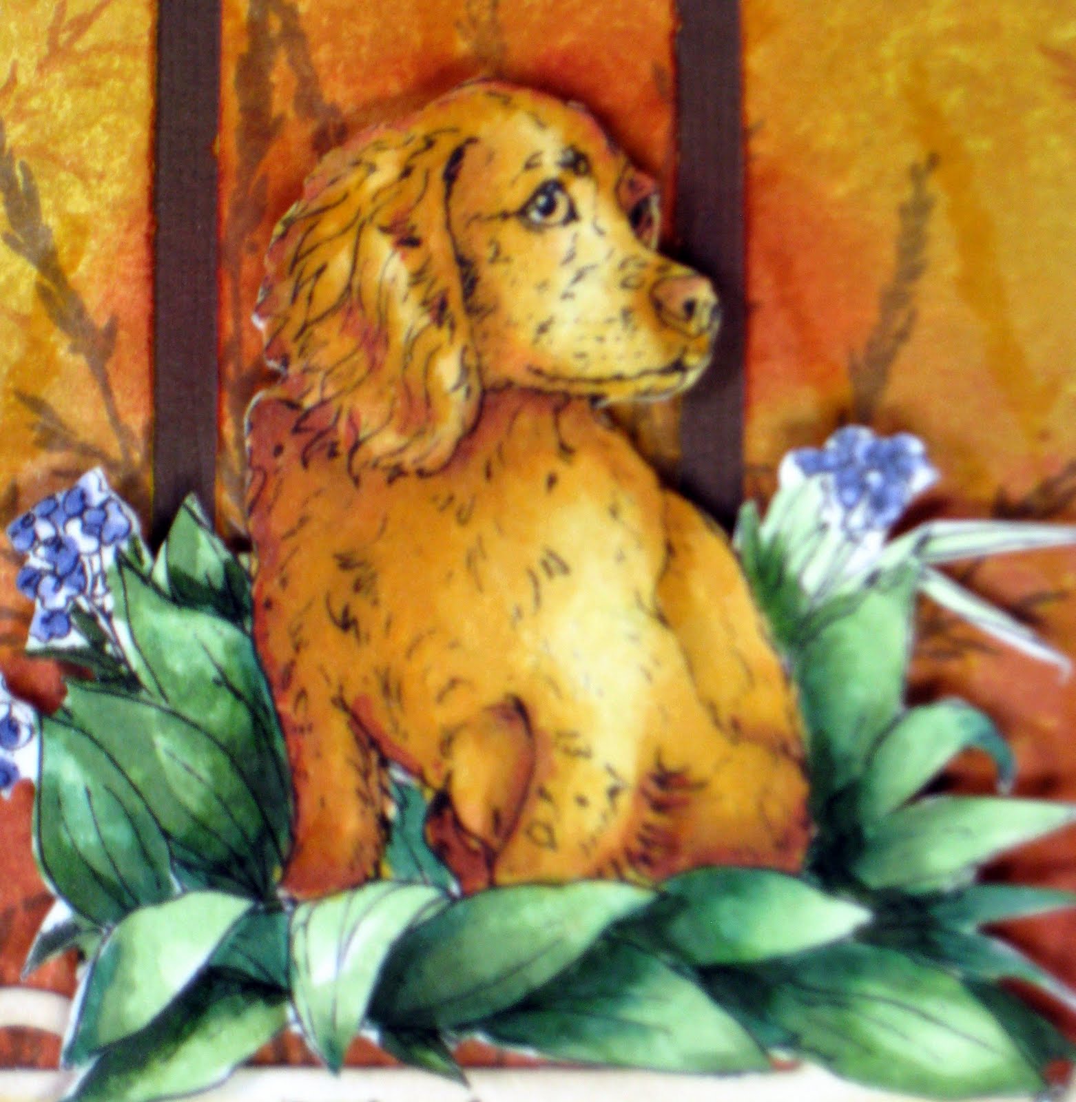
This adorable image is a digital from Just Inked called "Cocker Spaniel Pup" Doesn't he just look like he is so sad and missing your soooo much?! I colored the image with Copic markers and paper pieced the image over my background.


I applied ribbon and embelishmentst I used Fancy Labels for my sentiment.

Thank you for coming by and please stop by again soon. Leave a comment and let me know you were here ad have a great weekend!

HUGS AND Smiles,
Marie

Thursday, February 24, 2011

Tranquillity

This is another beautiful image by NICECRANE DESIGNS. I think the image is so beautiful and just makes me feel so tranquil. In these times, we can use as many tranquil moments as we can get! I used to live in Colorado on a lake that had frequent visits from two gorgeous swans. I couldn't help but remember Phoebe and Cecil (the names I gave them) and remember how many beautiful moments they gave me. I remember how worried I was when they needed to fly south for the winter. I said many prayers that they would make it safe and sound.


Measurements:
Card Base 5.5 in. X 8.5 in.
Score and fold at 4.25 in. (This makes card for a 2A envelope)
Base Layer 4 in. X 525 in.
Focal Layer 3.75 in. X 5 in
Focal Image Layer

Supplies:
Focal Image: Digital Image by Nicecrane Designs/Illustrator Ignacio Molina

Copic Markers: R000, R00, R11,B0000, B000, B32,YR000, YG91, YG95, YG99,
C0, C1

Card stock : GKD Pure Luxury White, Purple-Blue and very light skin toned paper by Bazzil

Ink : Memento Summer Sky, Bahama Blue and Paris Dusk.

Embellishments: Pearls

Tools: Scor-Pal or Scor-Buddy, Paper Cutter (I use Fiskars), Scissors (Tim Holtz helps reduce pain for those with arthritis!), Quickie Glue Pen, Adhesive,large sponge daubers, Tim Holtz paper sander to smooth paper edges after cutting. Cuttlebug or die cutter), small corner paper punch (1 inch circle punch will work if you do not have a corner punch), D’Vine Swirls embossing folder and Spellbinders Nestabilities Large Labels die.

Tip: When you score your card base make certain you place another piece of paper over the top of the card prior to scoring to achieve a crisp fold without getting unwanted lines on your finished card.

Tip 2: You will save a lot of blood, sweat and tears if you select your cardstock and designer paper prior to coloring your focal image. You may find you want to alter the Copic Marker shades or ink media based on your available paper. This is a taken from someone who did not always follow this rule! LOL!


Copic Markers: R000, R00, R11,B0000, B000, B32,YR000, YG91, YG95, YG99,
C0, C1


I cut the image out with Spellbinders Nestabilaties Large Labels. I mounted the image on a purple-blue card stock and realized I needed to darken the sky. I added Memento Paris Dusk.


Hugs and Smiles
Marie

Wednesday, February 23, 2011

Mark Twain Remembered!

The famous Mark Twain lived in Calaveras County and wrote his famous book that placed our Calaveras frogs in the spotlight. Graphic Designer, Ignacio Molina from Spain illustrated some beautiful Mark Twain digital images. Since I live in Calaveras County and have a fondness for Mark Twain, I created two cards with these wonderful images from Nicecrane Designs. You can find his wonderful creations HERE


Isn't this image wonderful? It look like he is having such a crazy, lazy summer day?


This is the inside of the card. I stamped "Tree Silhouettes" from Gina K Designs. I sponged the background with Memento Desert Sand, Potters Clay, Summer Sky, Angel Pink and Tangelo.


I really think this image is beautiful. It looks just like some of the beautiful areas around here. Living in the country does have some benefits..... miss all the craft stores ! LOL

Thank you so much for stopping by. I rally appreciate that you took the time to stop by! Please feel free to leave a comment and come back really soon.
Hugs and Smiles
Marie

Friday, February 18, 2011

Design Team Call!

Suzanne Dean, my Copic Marker instructor is having a Design Team call for "Color Me Creative Classroom". I just had to color a few cards in order to participate. How could anyone miss an opportunity like that! We needed to submit two cards or projects using Copic Markers. My first card was a gorgeous flower by Flourishes called "Thank You set 33". Now if you have picked yourself up off the floor from laughing, we will continue. I know.... it is a really strange name for a stamp but the flower is worth it! I have loved this flower stamp for a long time.


Measurements:
Card base: 8 1/2 " X 5 1/2", Scored at 4 1/4" and fold in half
Card Base Layer: 5 1/4 " X 4”
Coordinated Designer Paper: 5 " X 3 7/8"
Focal Base Layer: 3 ½ “ X 4 3/4 “.
Focal Image Layer: 3 1/4” X 4 1/4”

Supplies:
Stamp Set- Flourishes "Thank You" sett 33
Card stock- Gina K. Designs Pure Luxury "Pure Luxury White", "All Spruced Up"
Coordinated Designer Paper
Brads colored with copic markers to coordinate with paper/design
Waxed paper
Iron
Scissors, Quickie Glue Pen, Adhesive,
Copic Markers
Cuttlebug, D'Vine Swirls embossing folder
Ribbon
Memento Ink Cottage Ivy, Pear Tart, New Sprout, Tuxedo Black, Summer Sky


Copics: R000, R81, R83, R85, R89, C0, G99, YG63 and YG11
I embossed waxed paper with D'Vine Swirls and transferred it to my focal image layer with a hot iron. (Be sure your have paper in between your iron and the ironing board! Sponge Memento Ink onto the focal layer and your will see how the waxed image magically pops up! I then cut out my focal image and tied a bow that I made using bow easy.


I just love the waxed paper technique. Gina K did a tutorial on this technique and I have just loved it. It reminds me of a stained glass window behind the focal image.

My Second card was a wonderful digital image from Sugar Nellie called "Verity Standing".


Measurements:
Card base 8 1/2 " X 5 1/2", Scored at 4 1/4" and folded in half
Base Layer 5 1/4 " X 4”
Coordinated Designer Paper 5 " X 3 7/8"
Focal Base Layer Spellbinder Petite Small Ovals
Focal Image Layer Spellbinder Petite Large Ovals

Supplies:
Digital Image: Sugar Nellie "Verity Standing"
Card stock- Gina K. Designs "Pure Luxury White, Chocolate Kill"
Designer Paper
Memento Ink: Tuxedo Black, Summer Sky
Copic Markers
Ribbon
Pearls
Adhesive and Quickie Glue Pen


Isn't she just adorable? I just love her little face!


I submitted my cards today. I can hardly wait to see all the wonderful entries from my fellow Copic lovers!

I hope you enjoyed my cards. Come back soon!

Hugs and Smiles!
Marie

Friday, February 11, 2011

"We're Cool"!

Copic Creations' new challenge #43 is called "We're Cool"!. There are so many wonderful entries by so many creative people! I always learn so much from this website. There is always something new to learn for those of us that love Copic Markers! In case you would like to play along, the link is here .... Copic Creations


Measurements:
Base card 8 ½ in X 5 1/2 in Scored at 4 1/4 in and fold in half
Base Layer 4 in X 5 1/4 in
Designer Layer 3 7/8 in X 5 in
Focal Image Layer Labels Eleven Nestabilities

Supplies:
Digital Image: Sweet Nellie “Joy Sitting”
Card stock- Gina K Pure Luxury White 120#
Designer Paper
Coordinating Card stock
Copic Markers E000, E00, E01, E11, R20, C3, C5, C7, C9, BG000, BG01, BG05, BG07, BG09
Memento Ink: Tangelo
Scissors, Quickie Glue Pen, Adhesive
Rhinestone embellishments


This sweet image is a digital by Sugar Nellie and the name is "Joy Sitting". I cut the image around the legs and feet so that when I used my Nestabilities to cut the image, it would look as if she is sitting on something other than thin air! LOL! Yes, I know she looks like an angel but I didn't want to try having her sit on a cloud yet!


This is Joy Sitting with shades of violet.


Thank you for stopping by. I always LOVE visitors!

Hugs and Smiles,
Marie

Owl Always Love You

Happy Friday! This is a cute little card I made the other day. I think the little owl from Wink Wink Ink Digital is soooo cute!


Measurements:
Card Base 4 1/2" X 11", Scored at 5 1/2" and folded in half
Base Layer 3 3/4" X 4 3/4”
Focal Image and Base: Spellbinders Large and Small Petite Oval Nestabilities
Fancy Labels Spellbinder Nestabilities

Supplies:
Focal Image- Wink Wink Ink Digital - "Owlfie"
Card stock- Gina K. Designs Pure Luxury Base Weight Creme de Menthe and All Spruced Up
Scissors, Quickie Glue Pen, Adhesive,
Copic Markers E 30, E33, E35, E37, E39 Y13, Y15, Y18
Memento Ink: Tuxedo Black, Summer Sky, Tangelo, Cottage Ivy, New Srout,


I embossed the base layer with D'Vine Swirls folder. I wrapped the layer with twine and applied my focal image.


Have a wonderful weekend. Thank you for stopping by and come back soon!

Hugs and Smiles
Maire

Thursday, February 10, 2011

Furry Little Friend

As you know, I am taking classes on Copic markers from Suzanne Dean. She is now offering classes for Distress Ink. Now, doesn't that sound fun? Yes, of course I had to sign up for the class! LOL.

As with anything new.... one must practice. This is my first attempt at using distress ink. I tried to make the little bear look furry. I was a little worried about my paper. We are to use smooth watercolor paper. My watercolor paper has quite a grain to it. I tried to use it to my benefit and make it look like fur.


The little image is from Penny Johnson/Sampavie and the name is "Bear with Butterfly"

I have quite a bit of practice ahead of me in order to perfect this technique but I will have fun along the way. Suzanne will also be having a class on Prismacolor pencils soon. Yes, I will be one of the first to sign up! LOL

Wednesday, February 9, 2011

Thinking of You

Crafter's Digital Art Center is having a sketch chalenge. The illustrator of this wonderful digital image is Nettie Grooms and her shop is called Nettie G's Digital Gems. Check it out ... HERE

Everyone has such wonderful cards... The talent blows me away! Here is my entry for the challenge.


I just love the image. It reminds me of the times I would just sit and daydream at that age! OOPS... maybe I still do! LOL!

I have a week off from work. Yaaa - that means I will have time to get a few cards made. Check back soon!

Smiles and hugz!
Marie

Friday, February 4, 2011

Incredible Friends!!!


I discovered a new exciting place called "Crafters Digital Art Center". The site has new digital images by many gifted artists. The site is just waiting for you to sign on as a member and join in for challenges and fun.

This darling little image is called "Incredible Friends". As you know, digital images are the rage. They can be sized and the images flipped. The possibilities are endless! This digital image is from Nicecrane Designs and created by the very talented Ignacio. He has a passion for "Vintage" images. His website and digital images can be found.....
HERE

This a close up of the image, "Incredible Friends".


This is how I created my vintage background.


The challenge was to use this "Incredible" little image created by Ignacio and to give it a vintage look of at least 100 years. I used designer paper for the background and sponged Vintage Photo" Distress Ink around the edges. I used white ribbon and altered the color with a Copic marker that matched the color of the distress ink. W!hy invest in every color of ribbon when you can alter them with your markers? LOL OK, I confess, I alter my ribbon ... but I also have every color under the sun... You just have to have it!!! LOL


The focal image was place on the distressed background. As you can see, the altered ribbon coordinates nicely with the background and focal image. I then curled one bottom corner of the focal image with a quilling tool to enhance the vintage effect.

I hope you enjoyed my card and will stop by soon. If you haven't tried the Crafters Digital Art Center or visited Nicecrane Designs, please take the time to do so... you will be in for a treat!
Marie

Crafters Digital Art Center

I discovered a new fun site Crafters Digital ARt Center. The site has new digital stamps by many gifted artists. The site is just waiting for you to sign on as a member and join in for challenges and fun.

This is my first challenge with a wonderful Nicecrane Design by the very talented Ignacio The darling little image is called "Incredible Friends".


The challenge was to use this cute little image and to give it a vintage look.
This is a close=up of the background I used.


I sponged the designer paper with distress ink and used a plain white ribbon. I colored the ribbon (the area that would show) with a copic marker that matched the distress ink.


I am so excited. I lan to get Photoshop Elements today and I hope I improve the look of the edges of my cards for posting. I just love the way my Copic instructor, Suzanne Dean posts her cards. She makes a wonderful edge that blends and drawas the eye to the actual card without altering the original look. It just makes it look like it belongs on the screen! She emailed me the instructions on how she does this and I can hardly wait to get started!